Cycle Toronto is a member-supported non-profit organization that works to make Toronto a healthy, safe and vibrant cycling city for all. They focus on advocacy, education and encouragement, working to shape policy and infrastructure while transforming the city’s cycling culture. Cycle Toronto engages a diversity of people, and pursues evidence-based solutions that make cycling a viable option for all Torontonians.
Seeking to expand their reach, Cycle Toronto needed to improve their communications but they had a tight budget and inconsistent use of different graphic styles. We recommended strengthening the visual identity system and then equipping Cycle Toronto staff to create on-brand materials in-house.
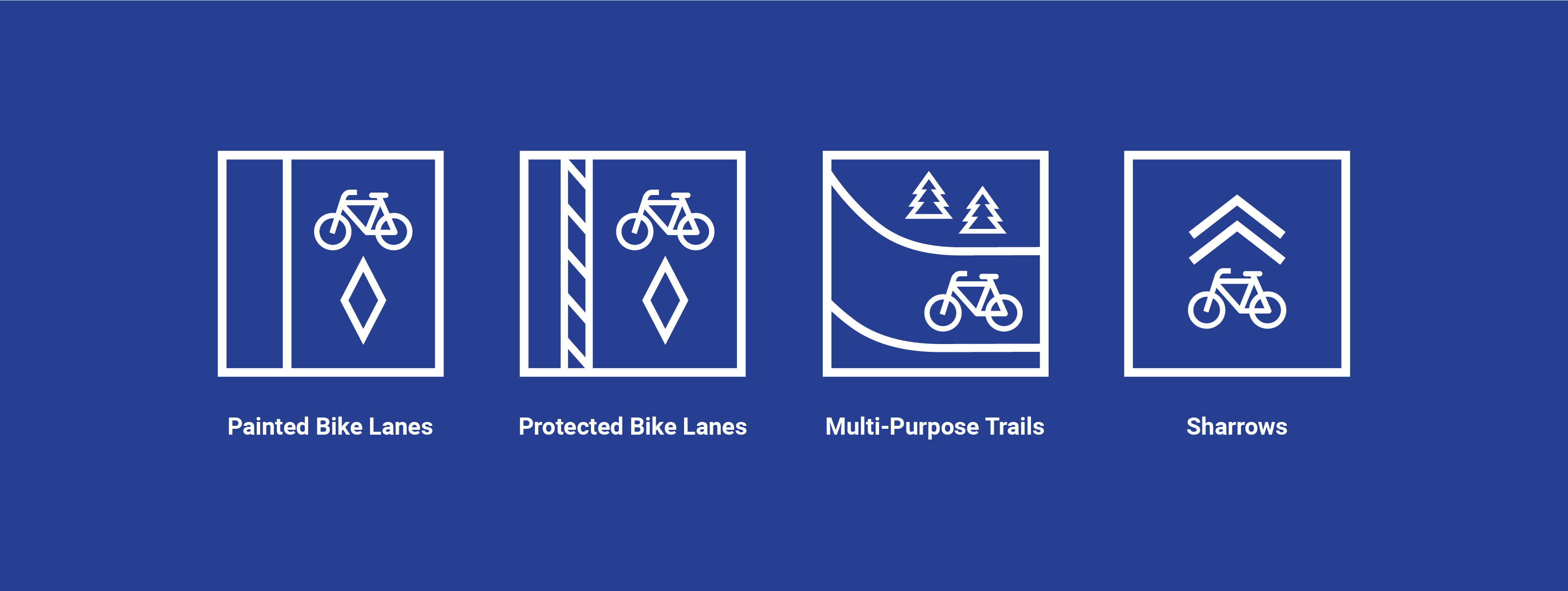
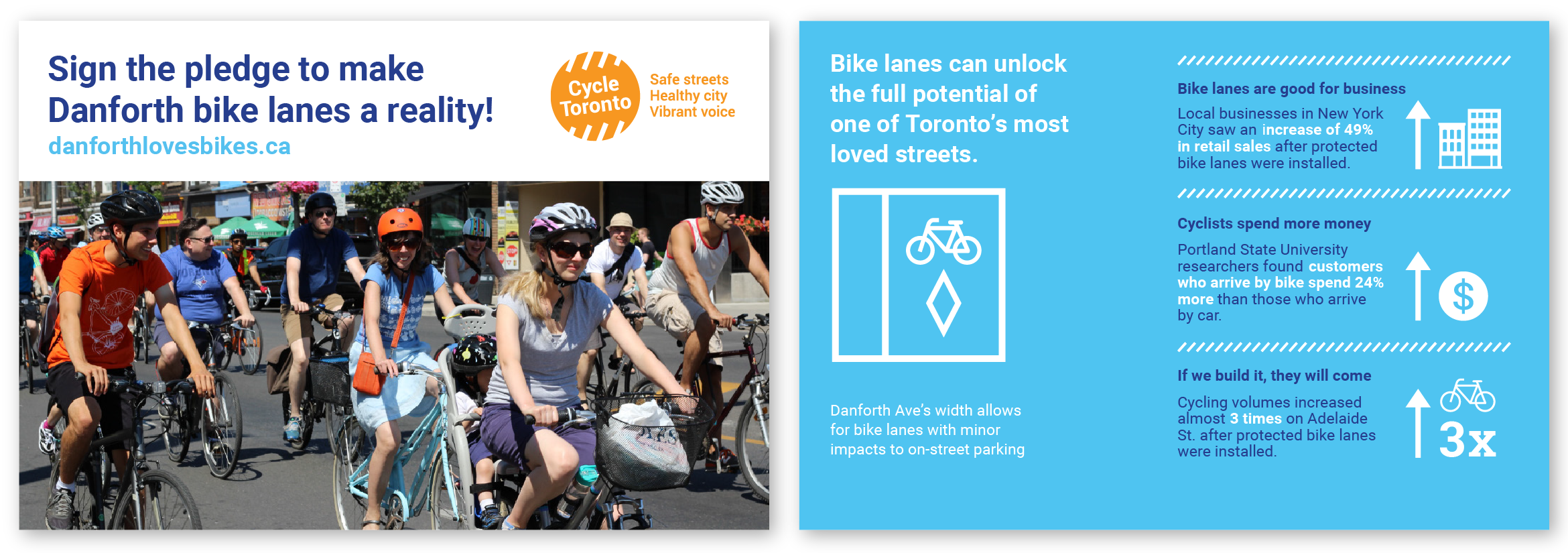
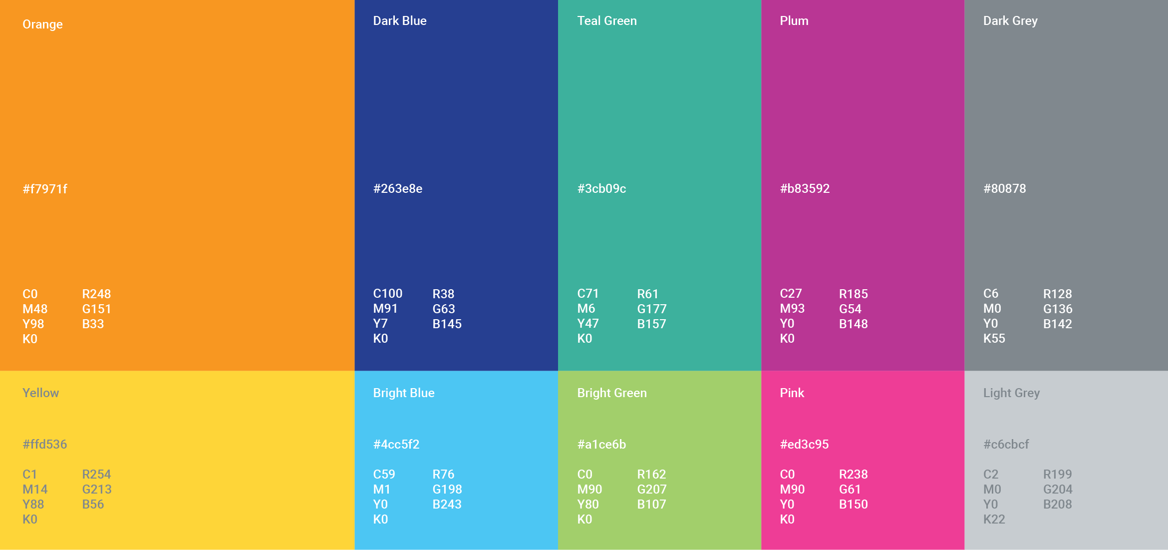
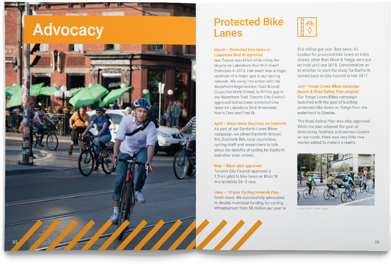
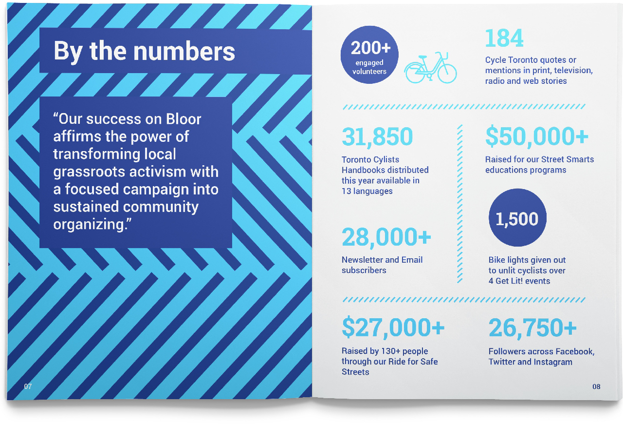
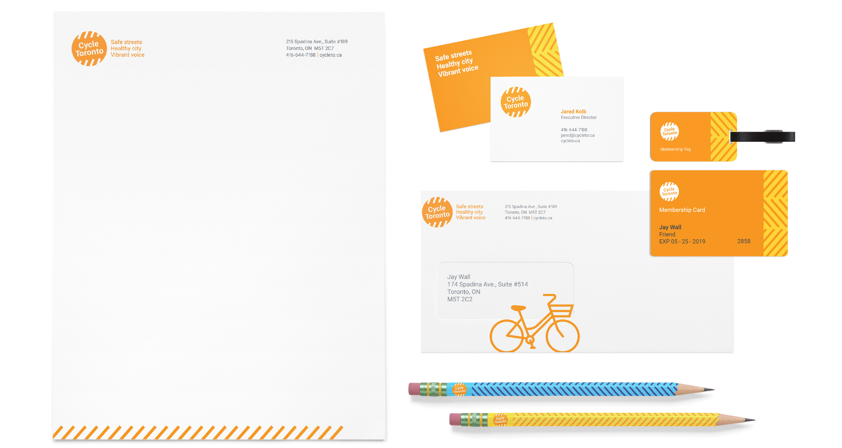
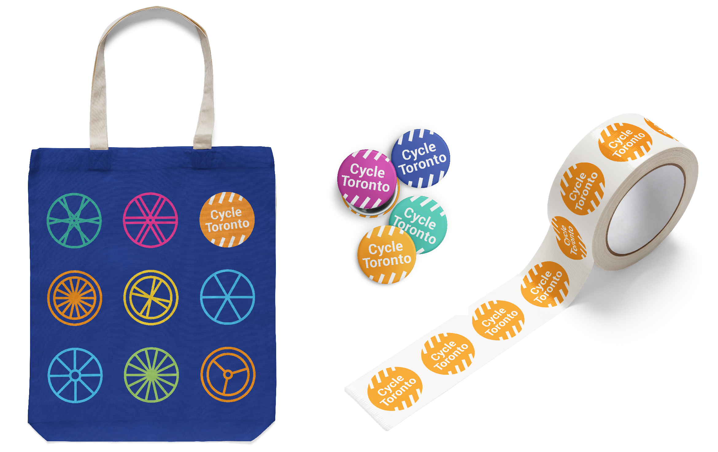
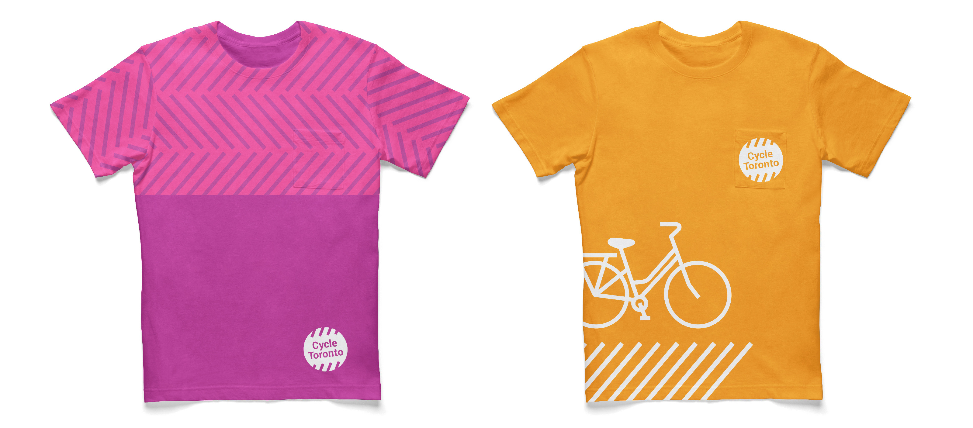
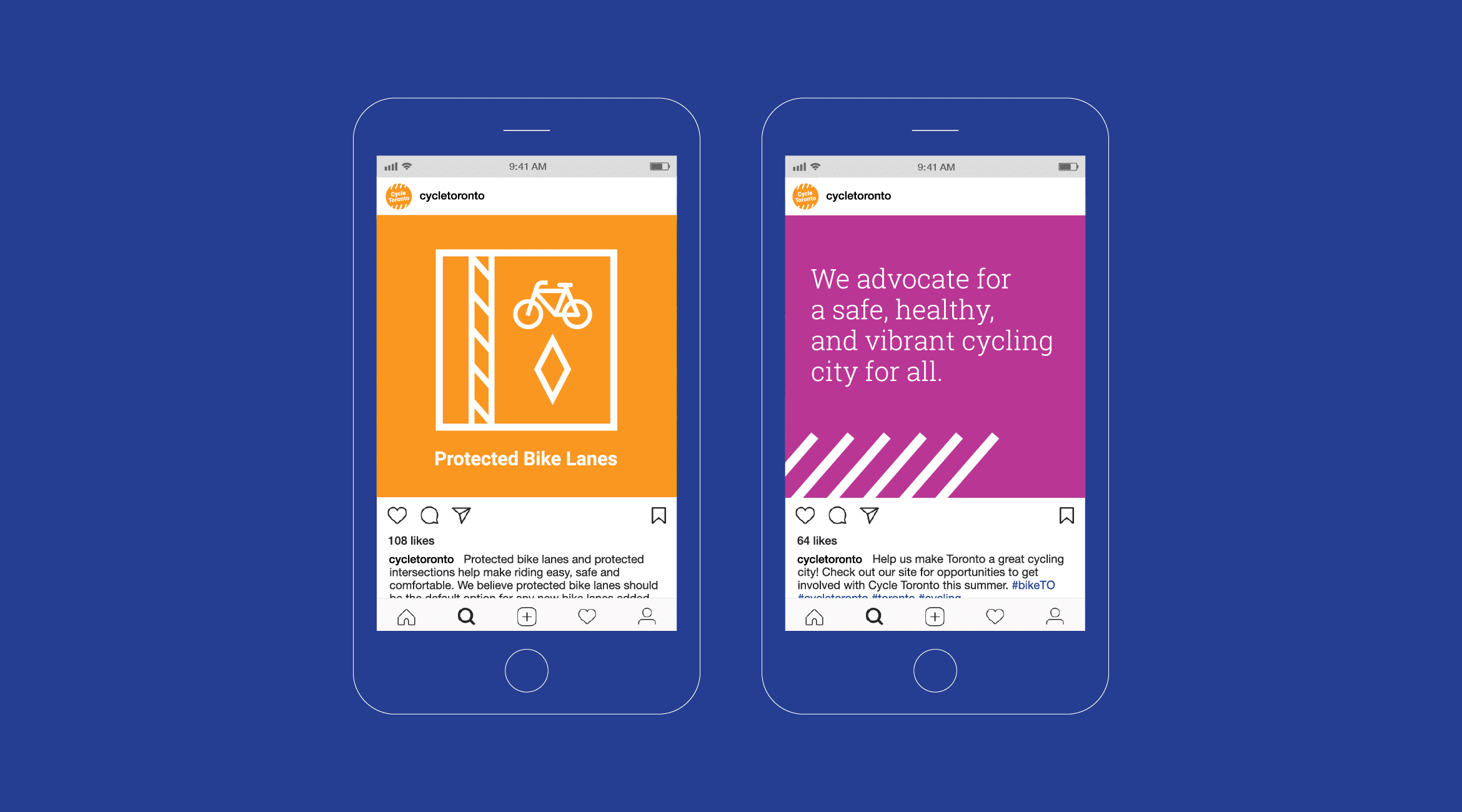
The existing logo – inspired by bike tire treads – already had strong brand recognition so we cleaned it up to improve legibility and scalability. We designed a comprehensive visual identity system around the new logo, including a bright colour palette, dynamic patterns and versatile icons. We also built a toolkit of templates so that Cycle Toronto can confidently produce items such as infographics, postcards, social media graphics, reports, merchandise and membership packages. The visual identity system is supported by detailed brand guidelines for consistent, high-impact implementation.
The result is an energetic brand that honours the legacy of a decade of advocacy while propelling Cycle Toronto forward in their efforts to make Toronto a great cycling city.